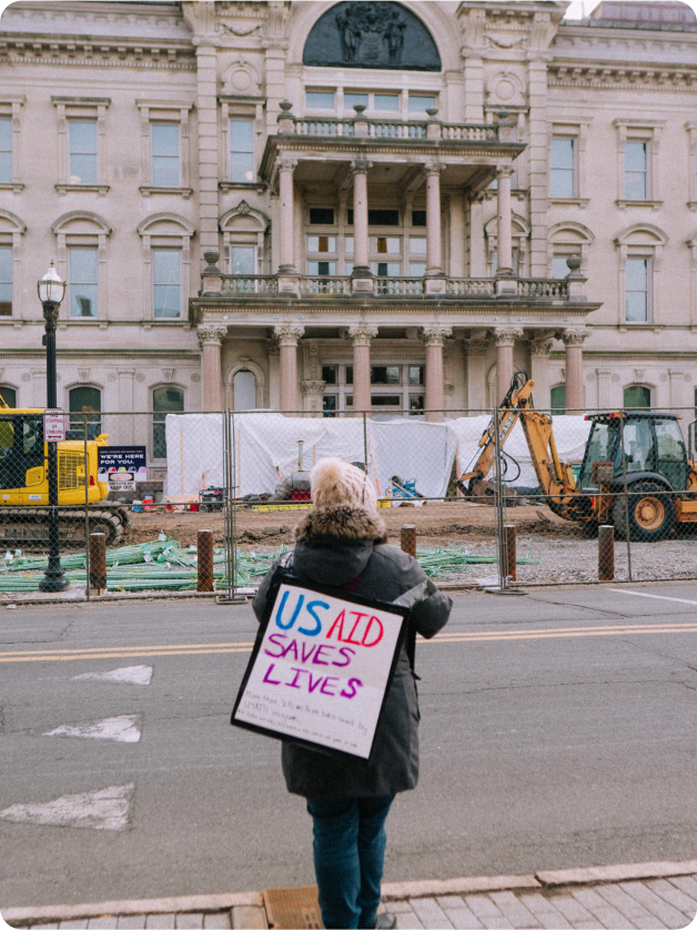
Wanna die in America?
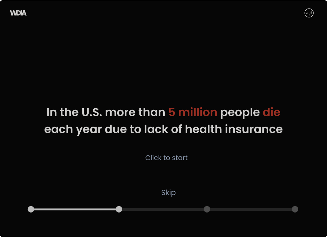
This project focuses heavily on awareness regarding the healthcare crisis in America. I aim to ignite concern, and show you how those who do not have health insurance have suffered.
The Result
Highlighting Reality
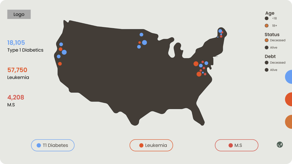
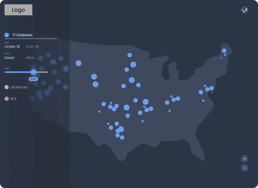
After countless iterations, I found that the dark background with the vivid colors, were the best way to present the statistic portion to the users. While the game portion is still in progress, the statistics alone show the horrifying reality of living in the Unites States without health insurance, which in turn raises awareness around this subject, which was my main objective.

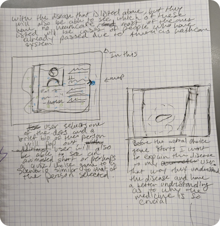
Sketches
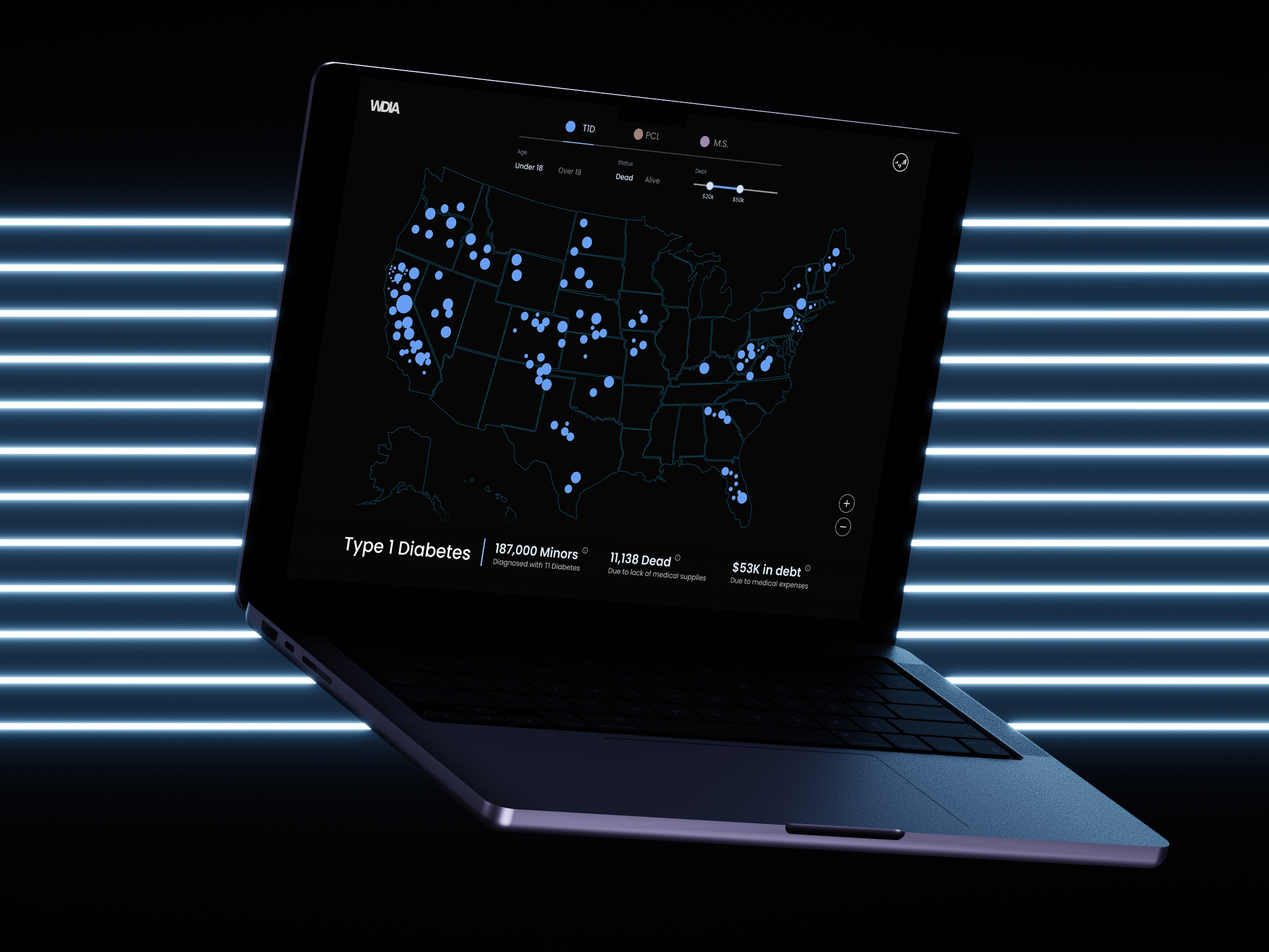
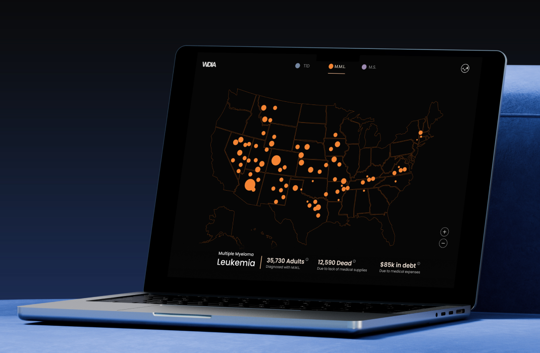
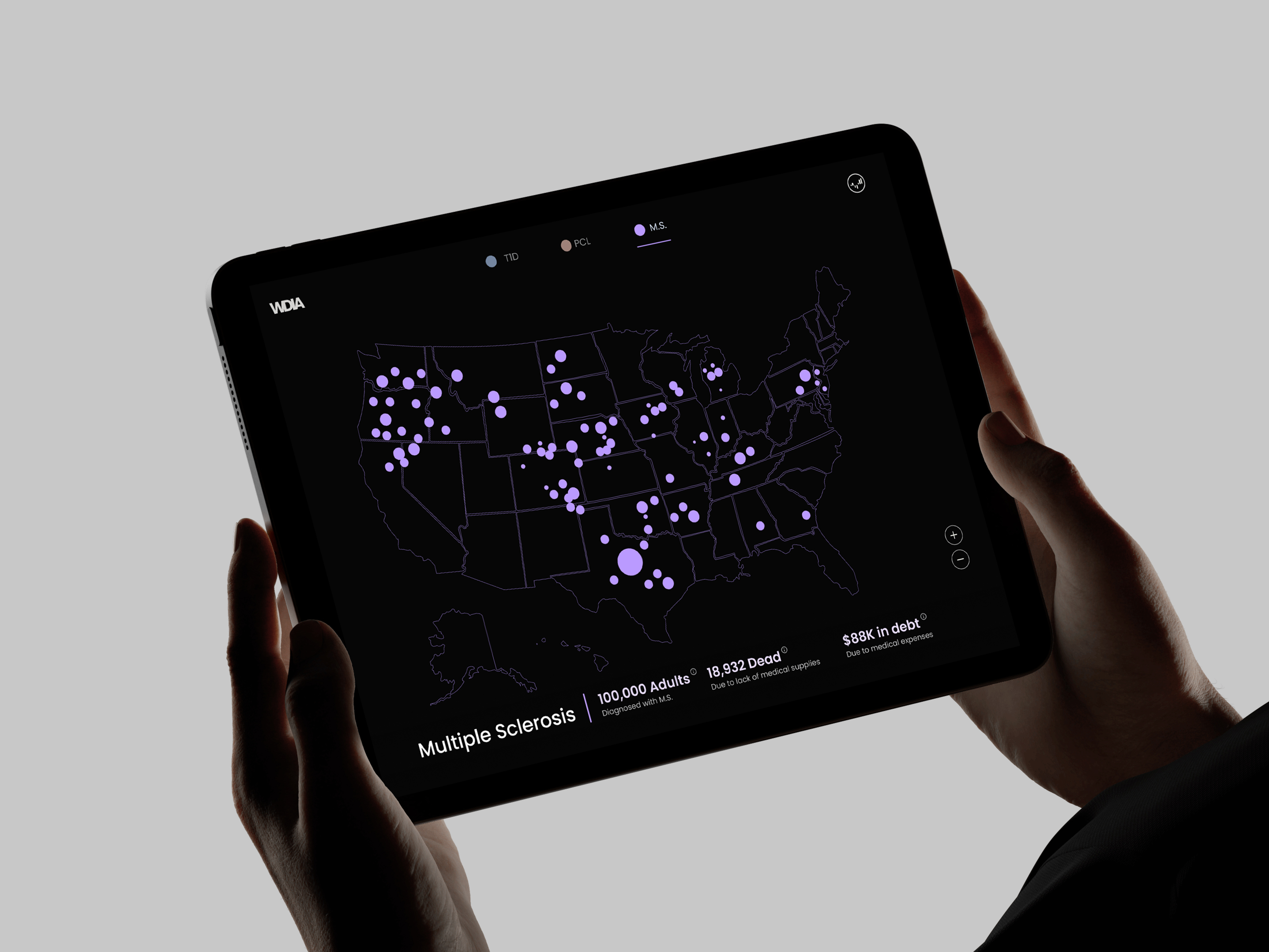
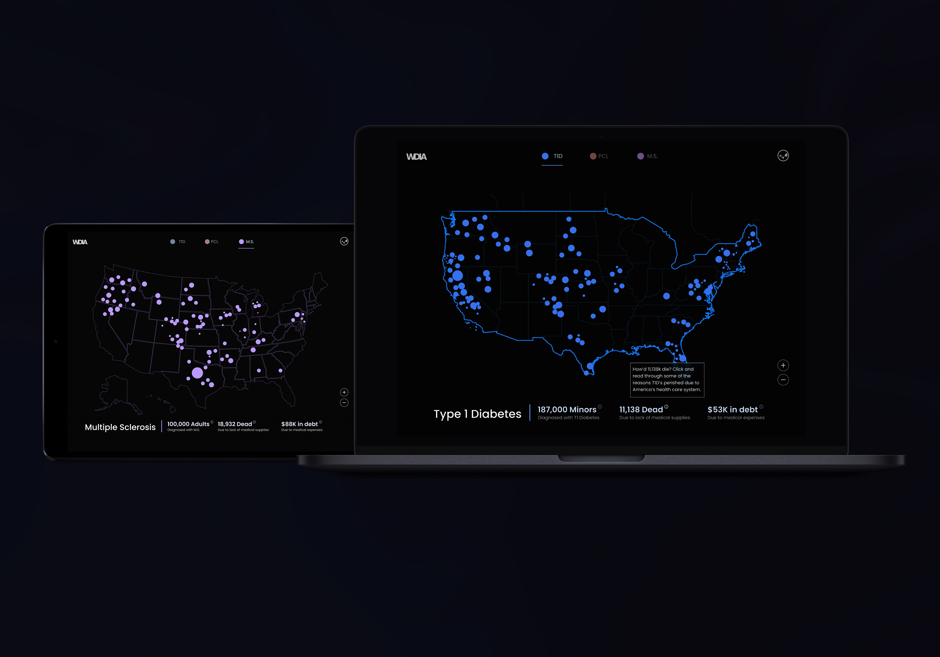
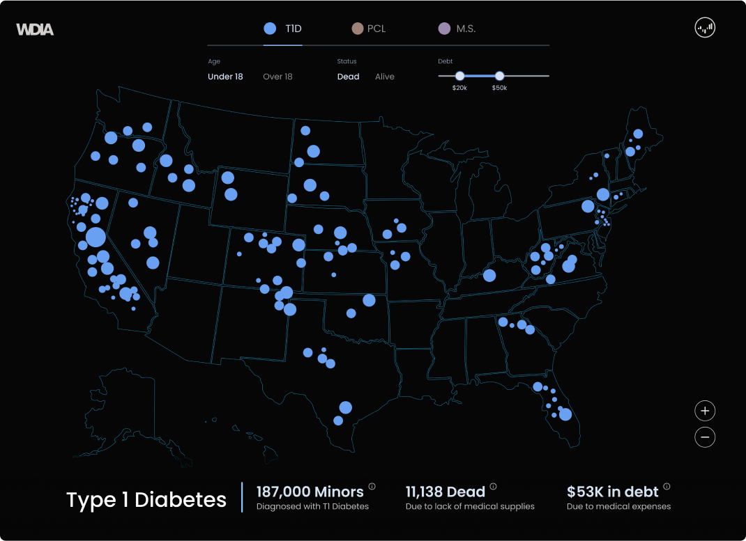
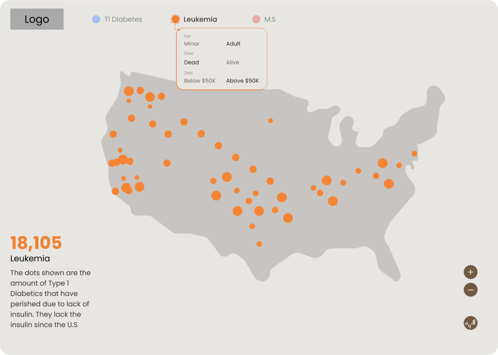
Showing the data
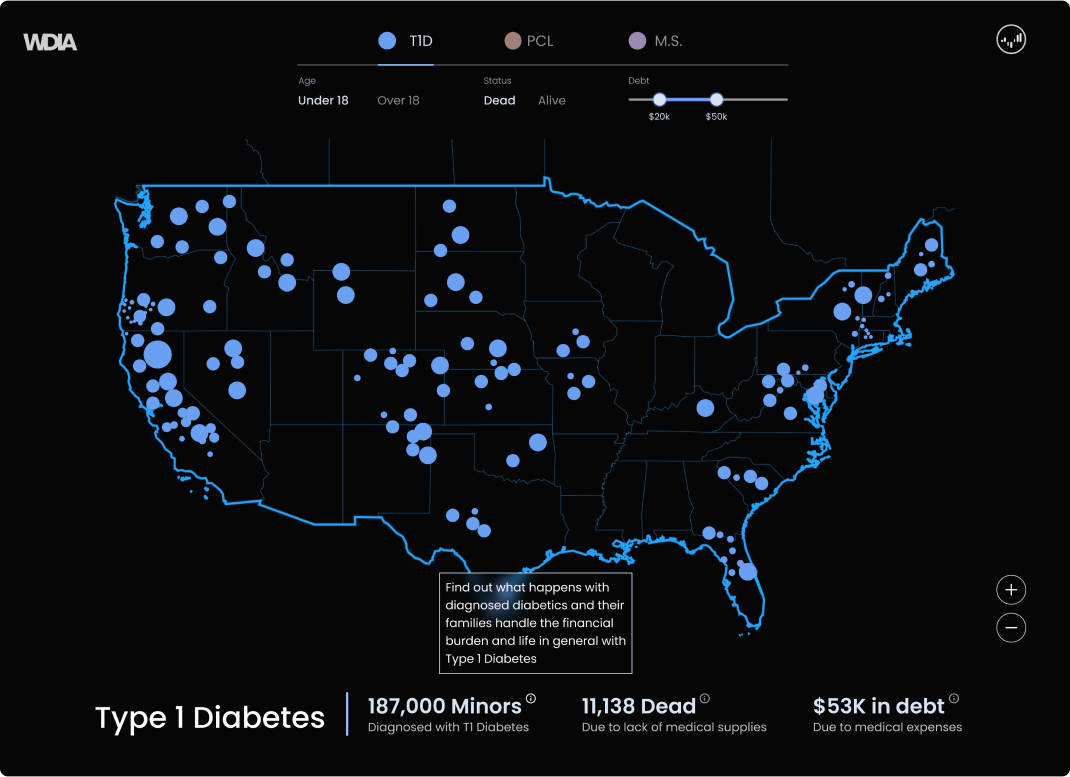
I focused on integrating a map to display local death statistics, aiming to evoke an emotional response from users so that they can see how many are affected by the health care crisis. Placing the map and the game afterwards seemed logical, enhancing the overall user experience.
Sketches
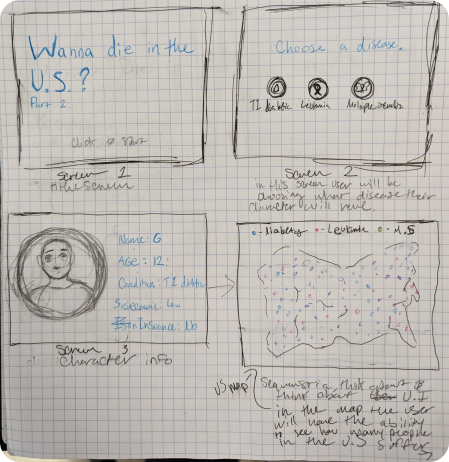
Iterations
Finding the best solution
Throughout the iteration stage, I experimented with both a dark and light theme setting which stemmed from my moodboards. Although, I found that the lighter theme made the subject matter feel too light-hearted. Finding the best way to display the information took me the longest since I wanted to make sure that it wasn’t in the way of the data, but I also needed to make sure it was easy to find.
Iteration 1
Iteration 2
Iteration 3
Style Guide
3 diseases, 3 colors
After countless iterations, I found that the dark background with the vivid colors, were the best way to present the statistic portion to the users. While the game portion is still in progress, the statistics alone show the horrifying reality of living in the Unites States without health insurance, which in turn raises awareness around this subject, which was my main objective.
Poppins
Light
The quick brown fox jumps over the lazy dog
Regular
The quick brown fox jumps over the lazy dog
Semi-Bold
The quick brown fox jumps over the lazy dog
Bold
The quick brown fox jumps over the lazy dog
060606
R6 G6 B6
699FF2
R105 G159 B242
F58534
R245 G133 B52
BA9AFF
R186 G154 B255
FFFFFF
R255 G255 B255
Reflection
What's next?
As a Type 1 Diabetic myself, this project meant a lot to me. I know I'm not the only diabetic who has feared being taken off of their insurance, so I wanted others to understand the devastating reality of not having insurance when you have a disability. Capturing the data and turning it into this data visualization design was the most challenging part of this project, but also the most fun. When presenting this in front of my peers, I saw a lot of surprised reactions, since many had not known the statistics. My main objective to raise awareness, was reached. The game portion and the live version of this project is still in the works!